Thursday, March 26, 2009
Eat the Rainbow
Contribution by Hannah
I was eating dinner and I thought to myself, what a colorful table. That’s when the idea came to me. “Eat the rainbow.” The foods that were on the table had such interesting shapes and were in such interesting bowls. The silverware was reflecting the colors of the tablecloth as well. I had never thought about it, but a dinner table is a great place to take pictures. The only changes I had made to the photos was the color. I hit the color boost once on each in order to really achieve the “rainbow of food” concept.
Photo-Fest Winner, P4 B
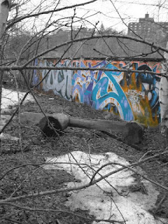
Grafitti
Contribution by Niki
I purposely left the building in the background to sort of form a contrast between the different lifestyles in the city. I also liked having the trees in the foreground for a sort of framing of the wall. In photoshop I changed it so that everything but the graffiti black and white to emphasis the artwork. I am inspired by graffiti...I think it is beautiful.
Old Boat
Contribution by Conor
This picture was taken over the weekend when the weather was like a taste of spring. This boat was something that caught my eye as soon as I stood on the pier. When I see the picture I think about spring and all the boats waiting to go in the water and i really wanted to capture that.
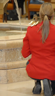
Duck
Contribution by Tanner
I like the the women in this photograph is to the right side of the frame and not centered. The nice marble pool and fountain add some background subject matter making this picture more pleasing. I really like how the duck heads of the canes are just resting on the woman's shoulder. I think that the best aspect of is that the actual duck is looking in the same direction and manor as the gold duck heads. I did do some cropping on the right side of the picture so only the woman and the duck were the subjects.
Back Bay
Branch
Contribution by Gabrielle
I took this photo in New Orleans while on a tour of areas near the Ninth Ward that had been torn apart drastically due to Hurricane Katrina. I chose it for my student of the week because I like the depth of field. While the glass is in focus and the rest is blurred, you can still get a sense of what's happened and that the structure is empty.
Wednesday, March 11, 2009
Aged Simplicity
Contribution by Nicole
The reason I chose to take this picture was because I enjoyed the contrast of the swing against the snow in the background. I also thought that the aged look of the swing added to the picture. The angle in which the picture is taken makes the swing appear as though it is moving. I was inspired by the simplisty of the old swing.
Fireworks
Contribution by Jonas
The safest time of year to set off fireworks is, for obvious reasons, winter. Right after a snowstorm, there was enough snow on the ground and in the trees to make it safe to play with fire. My friend and I were standing on a frozen river. I set my shutter speed to .5 seconds. My friend shined a flashlight at the ground right were the firework was placed in order for me to focus on that location when we set off the fireworks. He lit them, ran to me, and I snapped away.
It was difficult for me to decide what angle to shoot from, and how far to zoom in. And also, there is added pressure of getting a perfect shot before the firework runs out. I decided to shoot the photos slightly slanted so that I could capture more of the sparks.
While neither of these images are very great photographs, I still wanted to share them. They're an example of something neat you can do with your camera even at night in the dark. After exploring these different things that I can do with my camera, I can then work on perfecting each... but first I need to buy more fireworks :)
Rotunda
Contribution by Connor
I took this picture in Washington D.C. in the Capitol rotunda. When I saw the massive dome above my head, I thought that it would make a decent photo. However, I didn't want to have it be just plain radial symetry, so I didn't completely center the dome in the frame to add a little tension. I really like the sepia feel of the colors that I brought out when I used a color accent in iPhoto.
Sunflower
Contribution by Chelsea
I chose this photo for my student of the week post because it feels like summer to me. I like how the pussy willow is close to the camera making it blurry and how that makes it questionable on what it really is. I like how you can still see the green of the leaves and most of the other sunflower. I like how you can see part of another pussy willow pushing up through the back of the sunflower. I also really like the angle.
Friday, March 6, 2009
Contribution by Chaya
This photograph was taken at my grandparents house, at a small family dinner. My cousin was sitting in the window and I realized what a great photo opportunity she had created! So. I whipped out my camera and captured her staring off into the distance. I love the light in this picture and how the hill in the background really captures the essence of her expression.
Thursday, March 5, 2009
Blank Faces
Contribution by Lisa
I like this photo because it shows no emotion, only blank faces. Every break period during lunch my friends will sit along the same bench in a line. One lunch period while looking down the line of then all each would take a turn leaning their head out to speak to someone else and I got the idea to take capture this except in an orderly form. I think that the leading lines of the faces all being in a line adds to this picture.
Funky Chocolate
Contribution by Joanna
This was a funky chocolate I acquired from my work one time. I have never seen a chocolate with the print on it, as this one has. I started taking pictures of it before I had bitten into it, and realized it looked so much better once I DID bight into it. I love the teeth marks, and just the overall color of the picture.
Tuesday, March 3, 2009
Landscape of Lines
Contribution by Tanner
This is a typical winter landscape in Maine. There are a few aspects of this photo that I like. The trees stand out, but I like how they are frosted with snow, which adds a soft effect to the photo. The sky adds to the overall feeling of the picture, white. Its interesting how both the power lines and the recent tire tracks both lead into one point near the end of the street. The formation of those lines draws the eye to that point.
Contribution by Conor
This picture was one that I took on a walk during a snow day. This tree bearing these odd berries really stuck out in the midst of all the white.
Subscribe to:
Posts (Atom)